Project detail
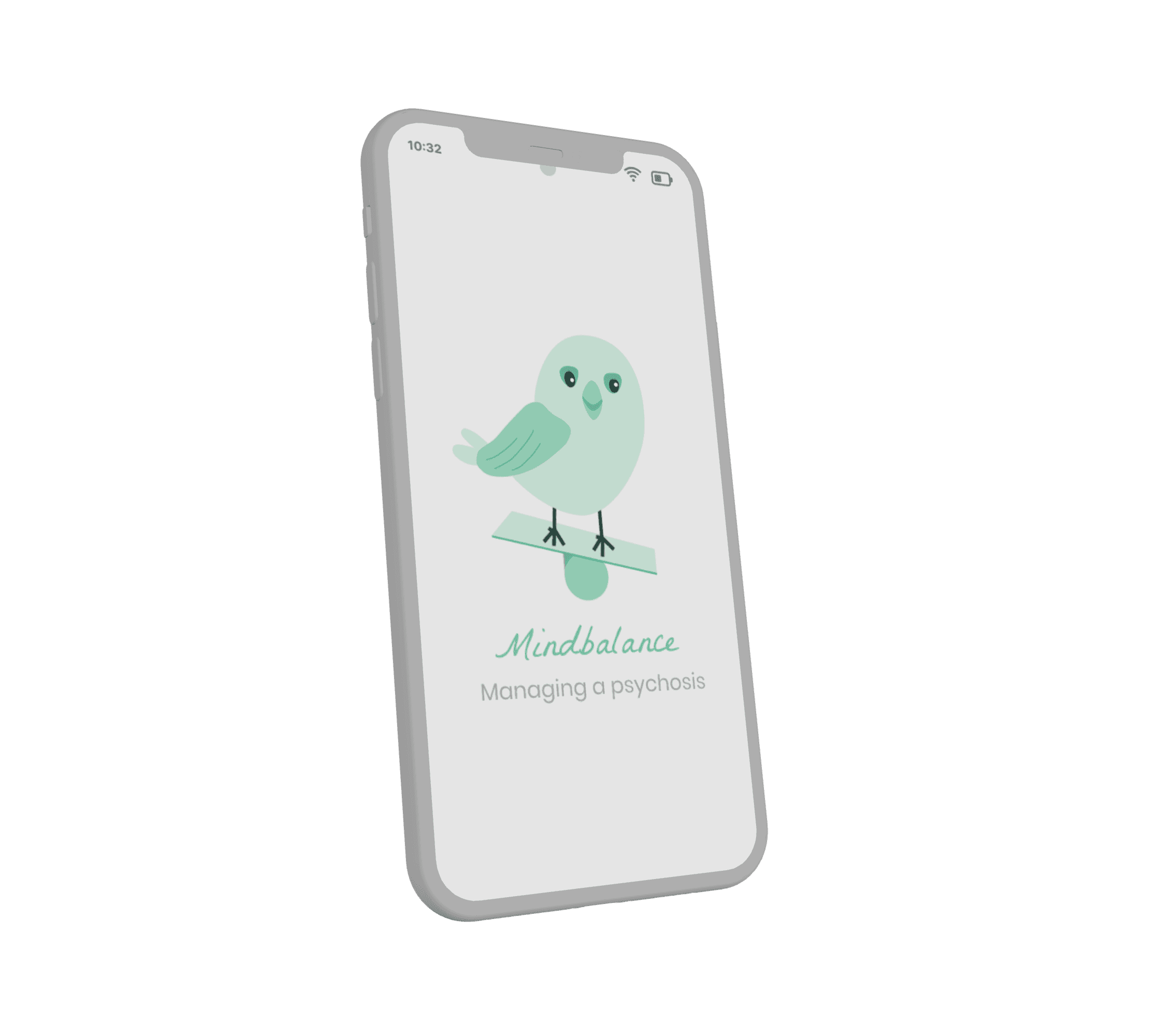
Mindbalance App
The Mindblance app is designed for individuals experiencing psychosis, providing them with recommendations on various coping tools.
Responsive Web App
4 months
Career Foundry
1 Context and outcome
1.1 Problem
People who have psychosis have various symptoms - ranging from hearing voices and other hallucinations to delusions. In discussions with therapists, sufferers try to reduce the occurrence of symptoms or even alleviate their severity. However, therapists are not always available, and few products assist.
1.2 Solution
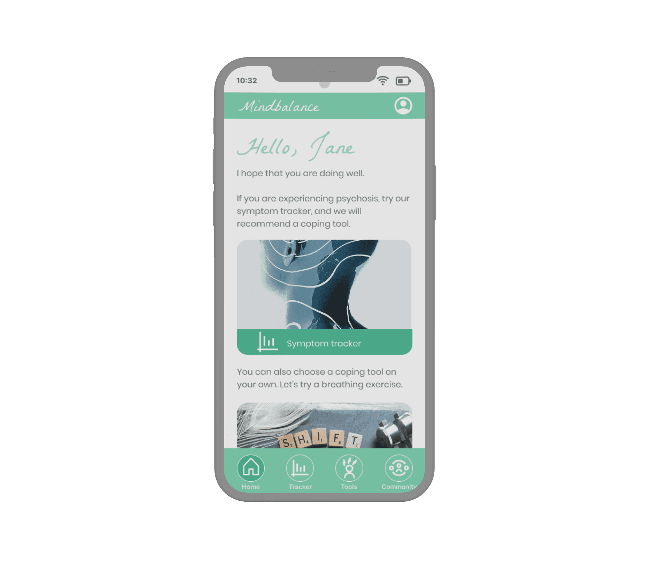
The app offers users personalized recommendations on various tools to help them reduce their symptoms. In addition, they can document how often the symptoms occur and communicate with others in a forum:
symptom tracker
coping tools
forum
2 Discovery phase
2.1 Competitor analysis
There are no apps available for people with psychosis in Europe. However, there are several indirect competitors for other mental illnesses or conditions. For these competitors, I conducted a competitor analysis and a UX analysis.
SWOT analysis of the mental health application Vos:
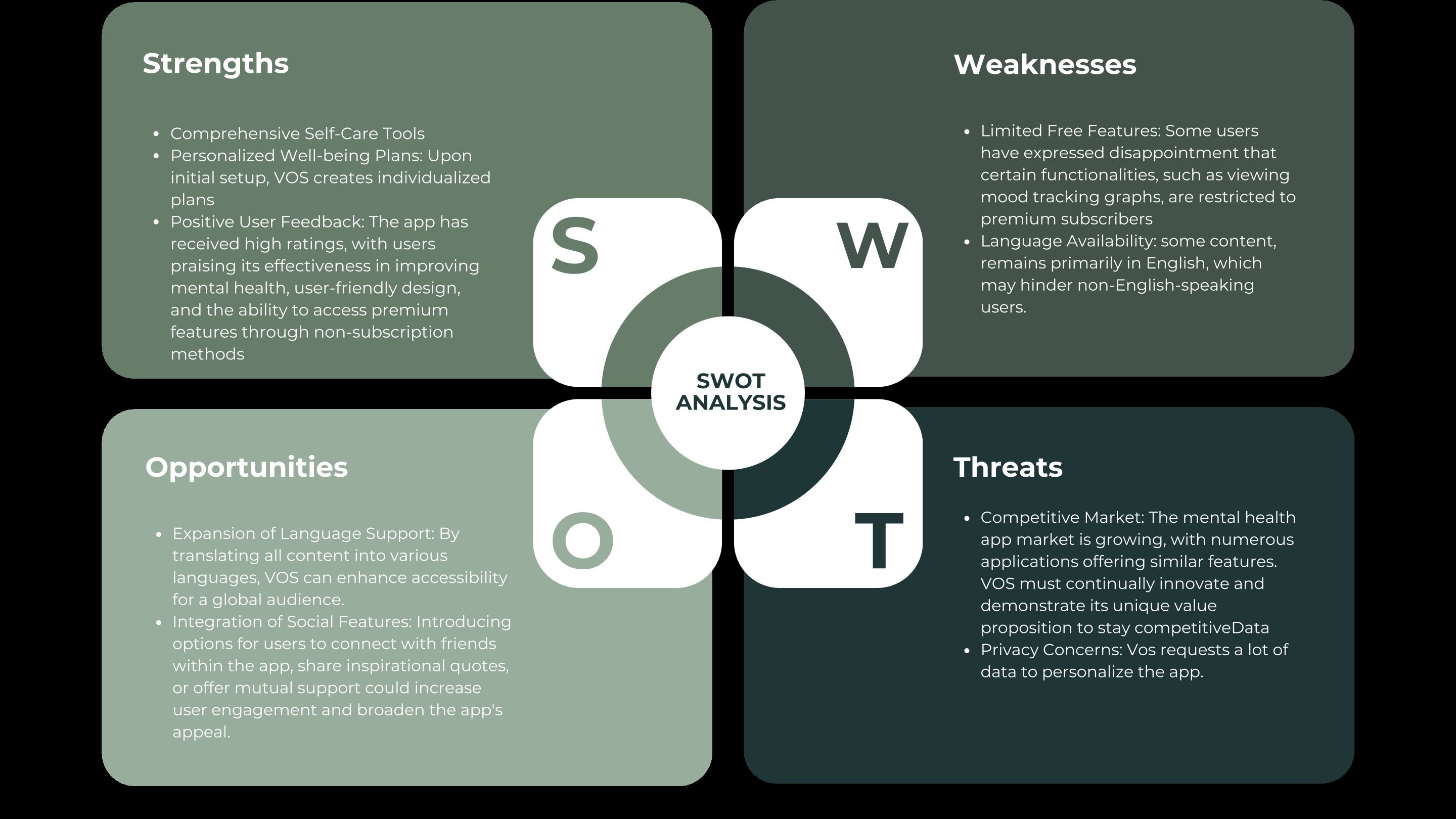
The SWOT analyses revealed, among other things, that the tools contain some coping strategies, but that their recommendations are not based on the current emotional state, but on a questionnaire that is completed after downloading the app.
2.2 User Interviews
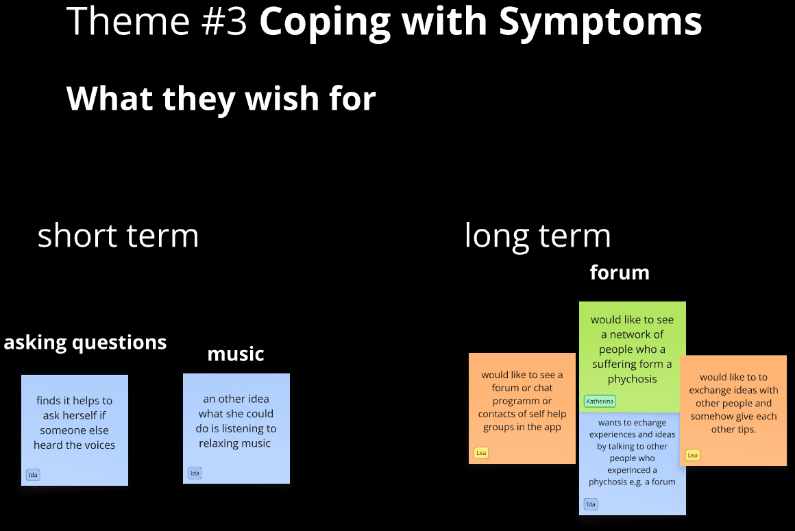
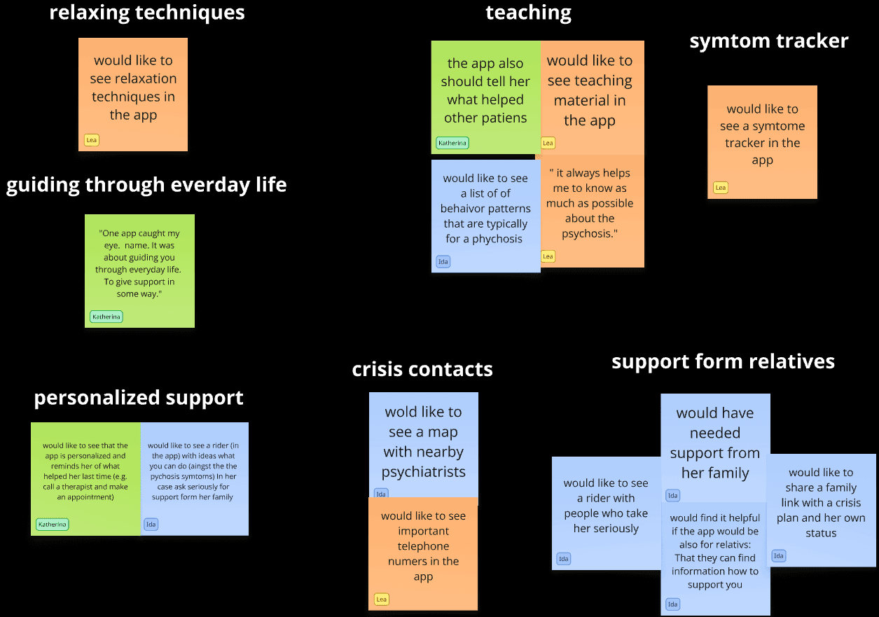
To gain a better understanding of what users with psychosis need and wish for, I conducted four interviews with people who have psychosis or had psychosis in the past. The interviews revealed that there is not only a need for personalized coping tools but also for exchange with like-minded people, a crisis plan, and a symptom tracker that allows medication to be adjusted according to the onset of symptoms.
To gain a better understanding of what users need, I compared what users want and what techniques they are already using to reduce their symptoms. The following is an excerpt from the wishes of the participants:
3 Definition Phase
3.1 Persona - Who I designed for
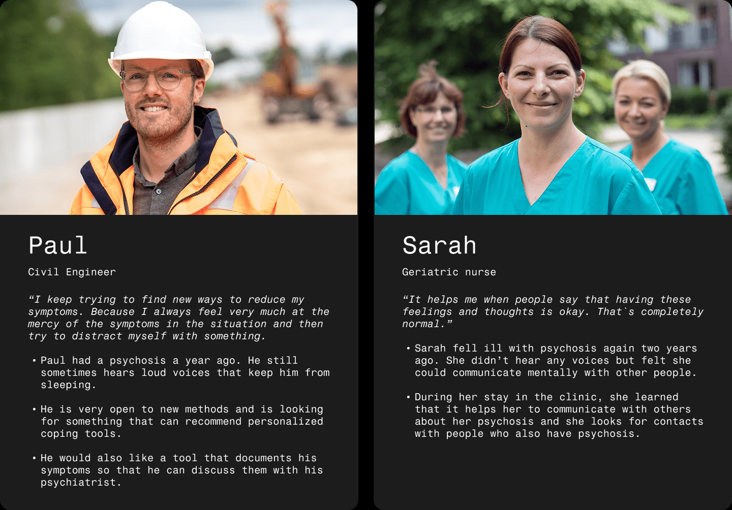
Based on the user interviews, I designed two personas, that represent the needs of the app's target group. The following is a short form:
3.2 User Journey
I created user journeys for the personas. Below, you can find one for Paul, who is using the app for the first time:
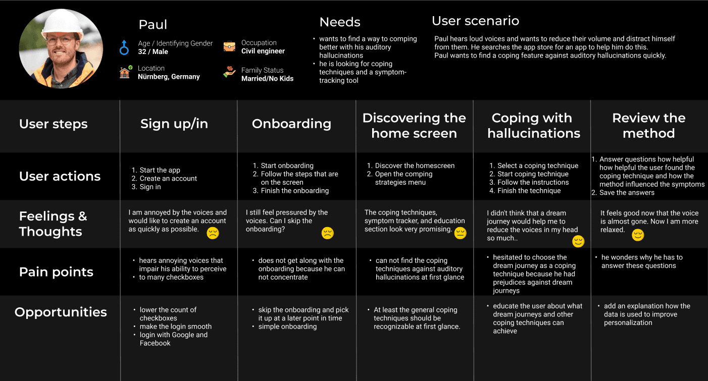
What I have learned by creating User Journey maps for the personas is that:
Users of the app might have a high-stress level when they have psychotic symptoms and try to use the app for the first time.
Consequently, onboarding should be short,
and the app must be designed particularly intuitively for this target group.
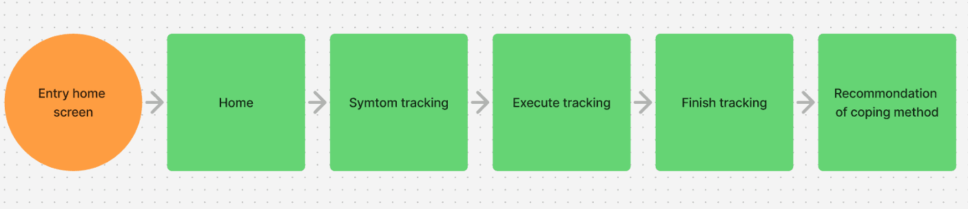
3.3 User Flows
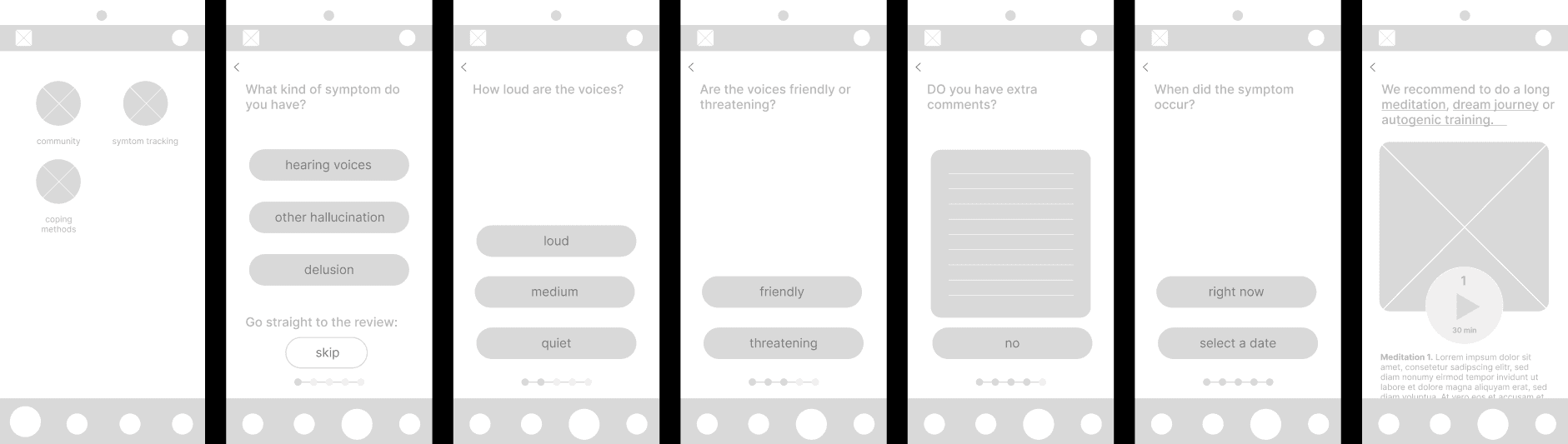
User flows were mapped out to define a clear, intuitive path for users to navigate the app. The symptom-tracking path is included below as an example.
3.4 Sitemap & Card sorting
The app's features were organized into a Sitemap and tested using card sorting with ten participants to see whether the app's users could find the features in the right categories.

For example, the card sorting test revealed that most participants thought the Support & Feedback section was in the Community section instead of the user profile. I have, therefore, created a link between the Community section and the user profile.
4 Development Phase
4.1 Low- and Mid-Fidelity Mock-Ups
Based on the user flows, I created low- and mid-fidelity mock-ups. I used these to gather feedback on usability from my mentors and other designers.
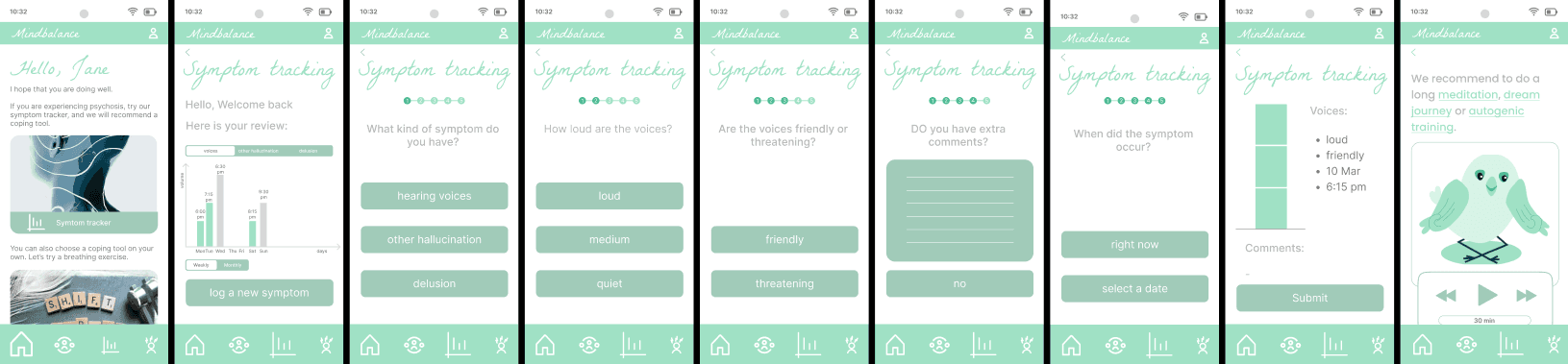
4.2 High-Fidelity Prototypes
Compared to the low- and mid-fidelity prototype, the high-fidelity prototype for the symptom tracker includes a home screen with the symptom history. At the end of the questions, the user receives an overview of the questions answered. This prototype was used to gather feedback from potential users.
4.3 Usability Testing
For the usability test, I invited six participants with psychosis, and they were distinguished by age and their use of digital technology. This test aims to identify hidden barriers that hinder users from reaching their goals, ensuring Mindbalance is intuitive and simple to use for the target audience.
Among other issues, I have identified the following key insights for the symptom tracker feature:
Issue 1: The "Log a new symptom"-button is not obvious. (high priority)
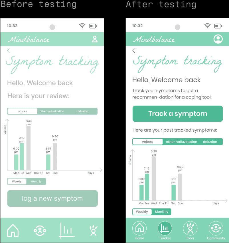
To counter Issue 1, I changed the button's name, added a description of its function, and moved it to the top of the screen. Furthermore, I increased the buttons' color contrast.
To see the entire final prototype of the app, click on the following link:
Figma Prototype
4.4 Design system
To prepare the final screens for handover to the developers, I created a design system that provides a guideline for using colors, fonts, etc.

